Interactive org chart
To help foster collaboration and break silos
Nov,2017
Client
CARE Innovation
Role
UI/UX Designer and Strategist
Deliveries
Interactive org chart pilot
Background
CARE had 97 country offices and over 4,000 staff globally to address humanitarian challenges. Even though we have diverse talents, it was challenging to navigate or took longer than expected to connect to the right person or resources. Meanwhile, our executives board wanted to explore smart ways to foster collaboration and break silo.
When I joined CARE Innovation, several initiatives were just established in the early stage and had recruited numbers of new hires. As a newish team and was keen to collaborate with country offices' (COs), many COs and programs' colleagues were unfamiliar with our scope and the traditional org chart wasn't quite helpful for internal sourcing and communication. Therefore, I designed and developed a digital and interactive pilot to help enhance the innovation team’s internal visibility and connectivity.
Role:
I led and built the whole work, including interviews, creative direction, design, development, and testing for feedback before launch. I collaborated with team members for data input, content strategy and feedback, also consulted with the engineer for recommendations.
Time
1 month, including research, data collection, feedback, and iteration.
Define
Conducted 20-30 mins interviews with 5 internal and external team members to understand existing challenge and needs to help shape design decision.
Problem

Organization version of org chart
Traditional org charts can’t support the dynamic needs
Can’t help understand team’s or individual’s capacities or scope
Can’t tell what areas could work together or overlapping interest
The process of finding the right person to talk to is inefficient
Sometimes high volume of email requests was overwhelming for senior leadership.
Users’ needs

users’ journey with the new platform

Design
tools analysis
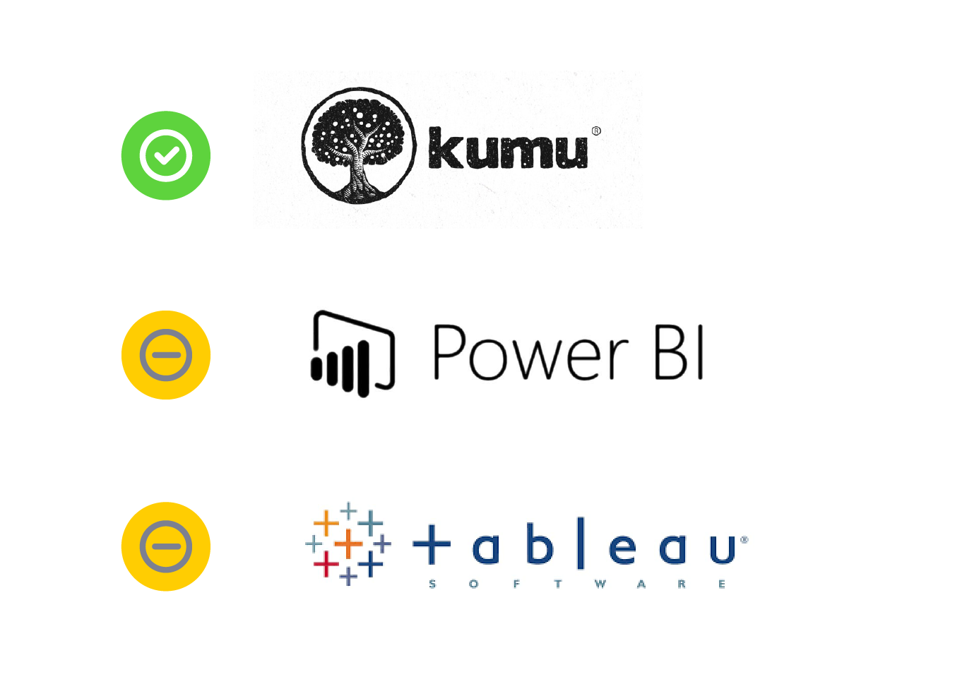
Because lack of resource and my design goal was to validate assumption instead of building an interactive platform from the scratch, I searched online tools to look up for
intuitive to use
mapping diagrams
appealing visualization
interactive cards to provide additional information.
access to backend data sheet to provide update
Under all of the constraints, I managed to find a platform, called Kumu.io, which aligned to my needs.
Ideation
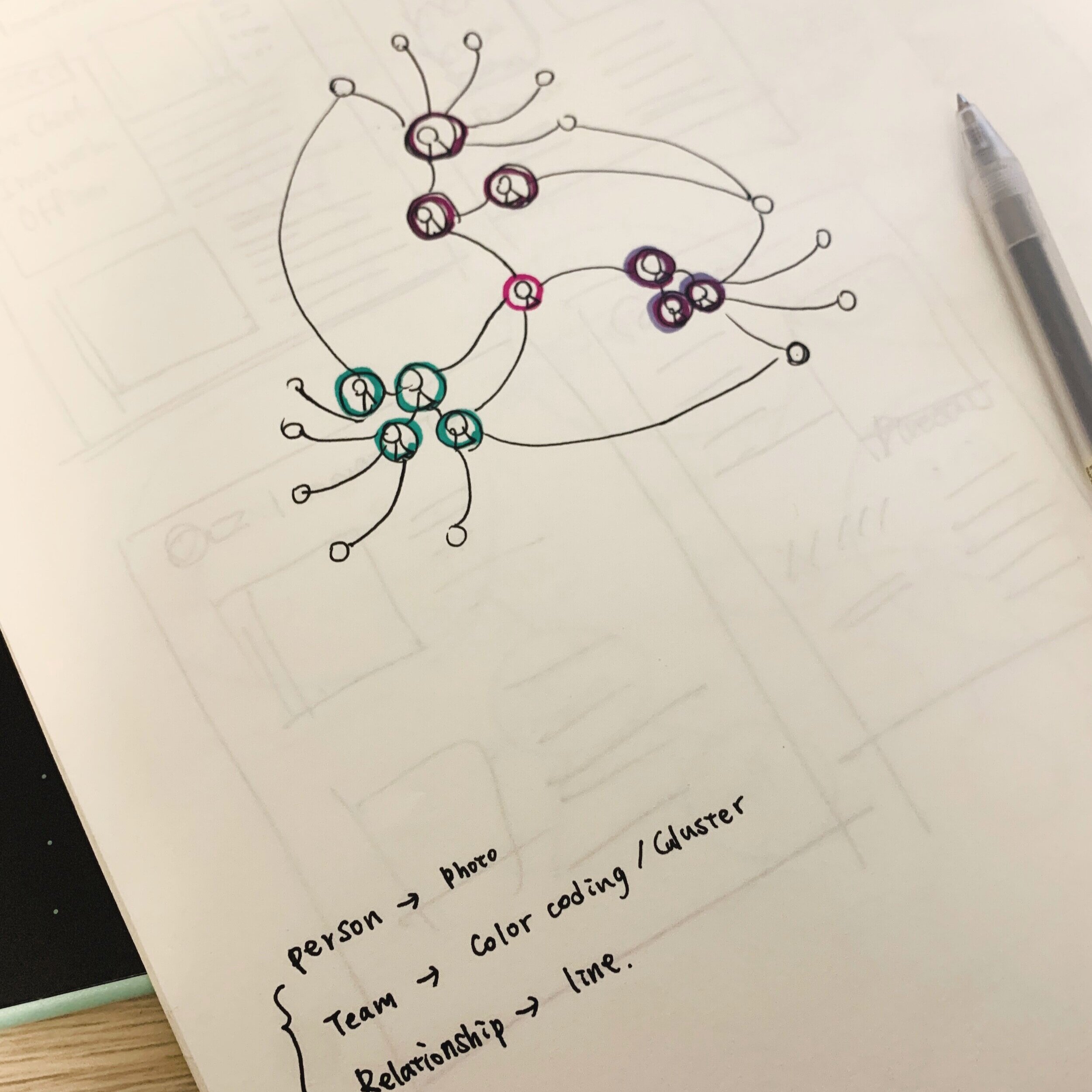
While I was building the digital pilot, I also designed for print version which helped me determine the visualization easier.

Information Architecture
After having a basic understanding of the rules of Kumu’s data input and hierarchy, I started working on the information architecture which I developed a framework and defined the relationship then requested the team leads and team members’ input to provide more detailed information on the google sheet.

Below is a close up of the sheet:
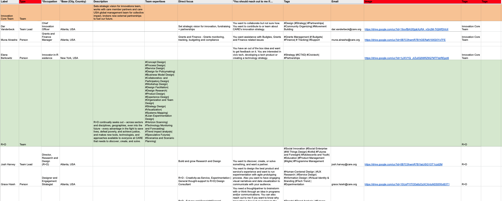
Connecting to google sheet that proves a real-time change so it could help reduce steps of works
Visual AND DEVELOPING
Defined the CSS.
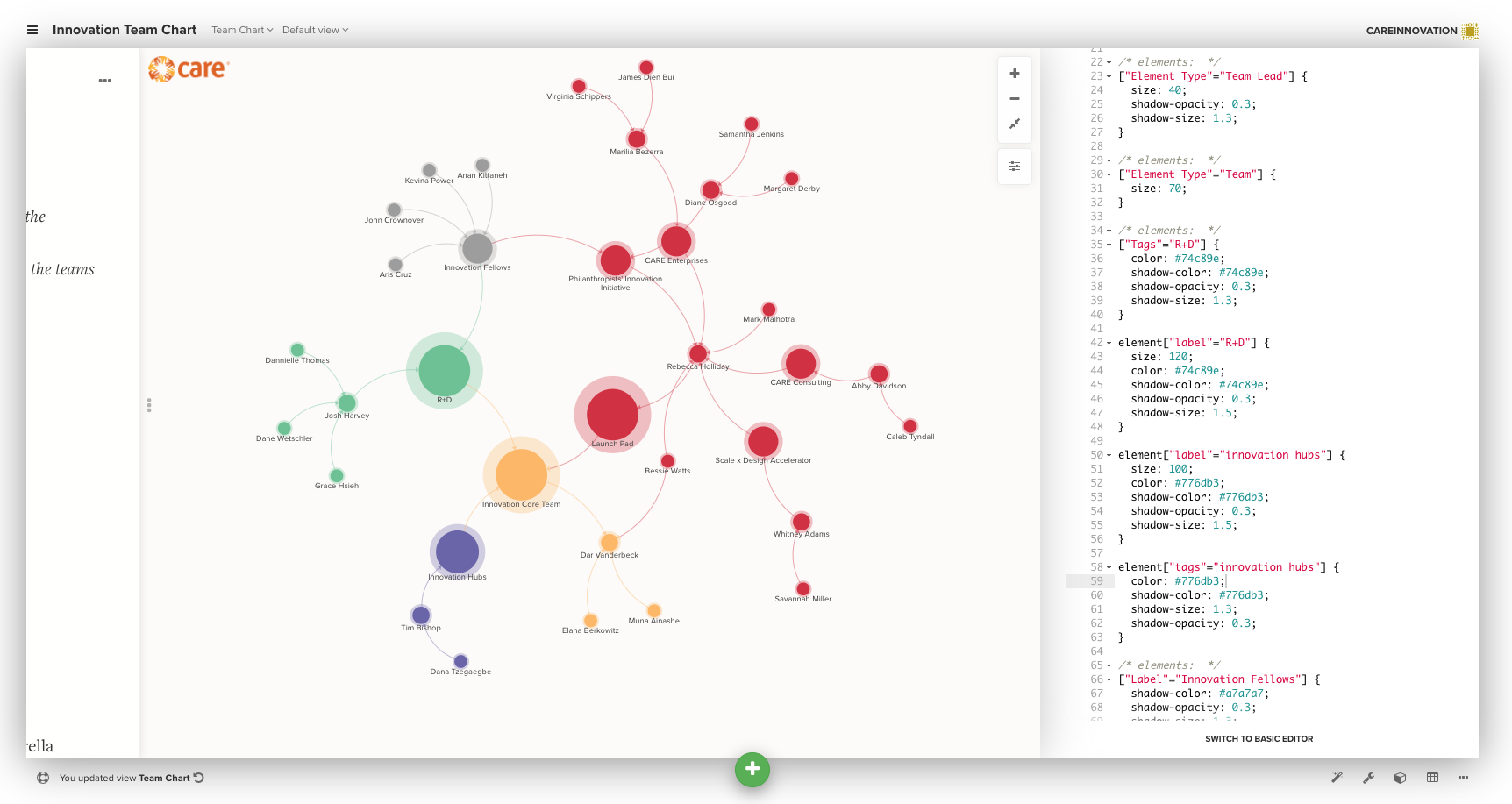
Final Pilot
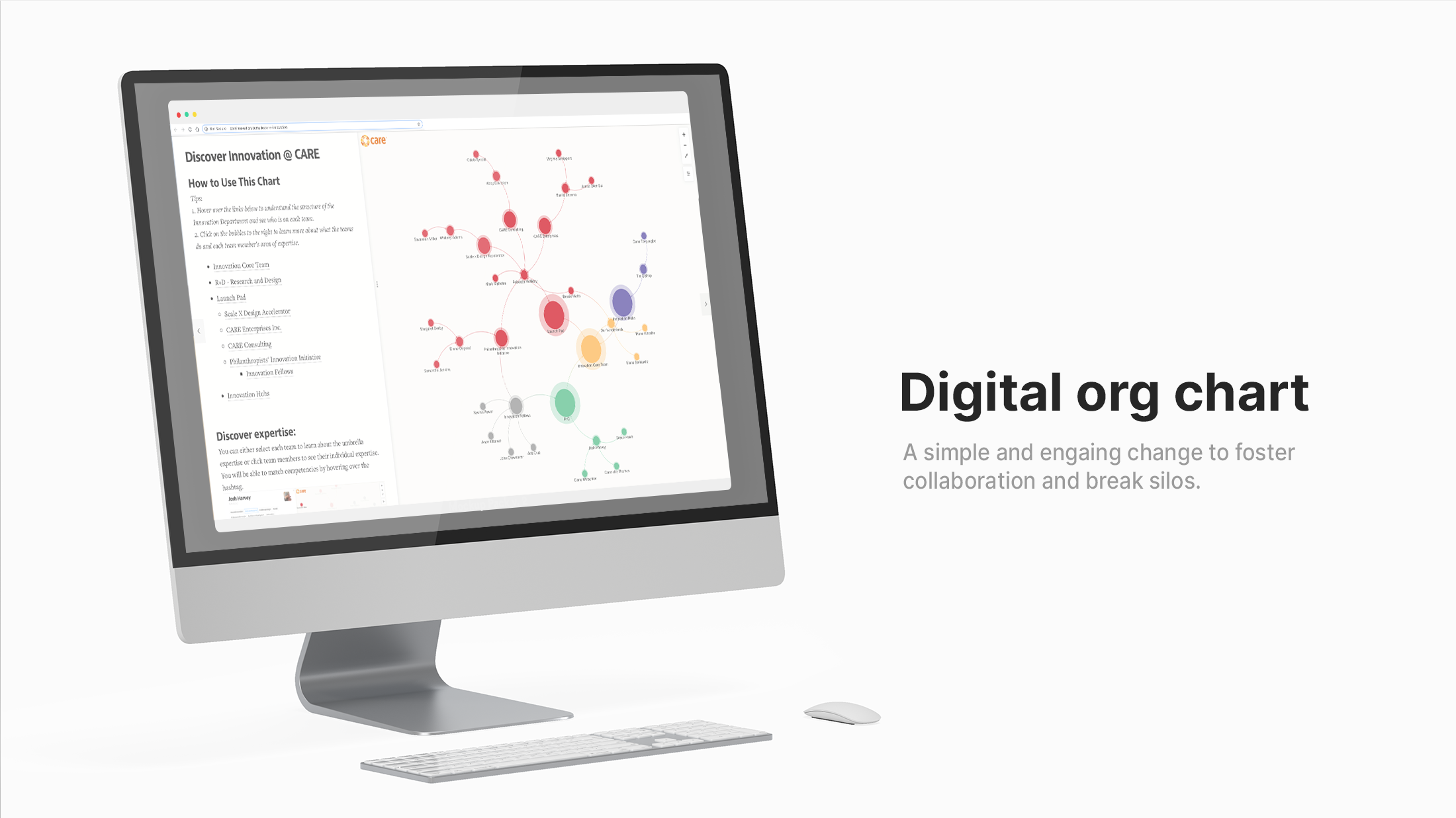
Click the image to launch the platform
KEY Features
Additional landing page to briefly introduce the team’s vision and scope.
Guidance to bridge the learning gap.
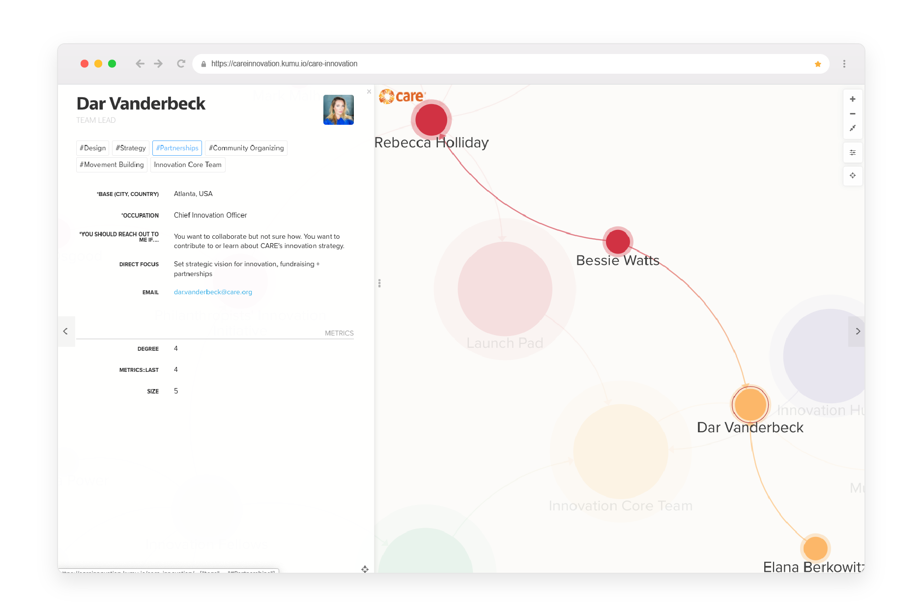
Hover to find out the hierarchy and click to read more detailed

Cluster to discover hidden connections between each team member, like competency.
Highlight Team / Team Lead / Person by filter out irrelevant information.
Measure and Learn
results
People were looking for creative ways to work together but always relied on endless phone calls, emails, or meetings to find overlapping interests or right capacities. When the interactive chart was presented to the executive board, we got positive and exciting feedback, and it scaled up to two other departments.

According to the feedback survey, more than 50% of the audiences used it to bring up to speed on learning general structure and offerings, then 32% of the viewers like to have a sense of who they can work with in the future.
There is room for improvement, like 16% of folks would love to have more in-depth instruction on how to navigate the digital chart.
Senior leadership were curious about how this could scale up to the lager organization but it was not the priority at the moment, so we didn’t explore that option. After our team experienced internal restructured and shrank to a smaller team lately, there was no need to use this chart; instead, we developed the innovation team website to communicate our impact and offerings.