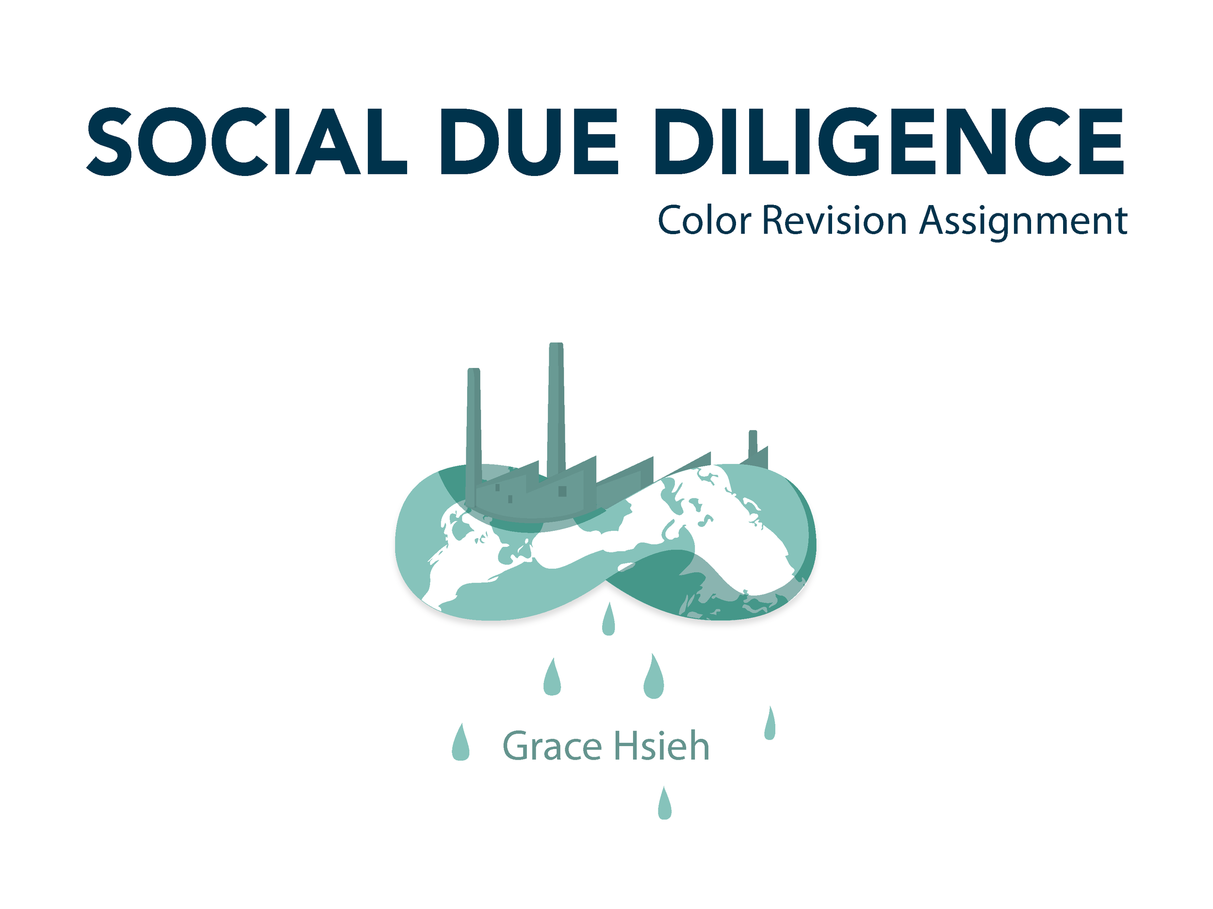
Social Due Diligence
Visualization to compare and uncover four beverage company’s social impact for eco-investor to take consideration
oCT- NOV 2015
client
x
role
Lead Designer, Data Analyst
deliveries
Data Visualization
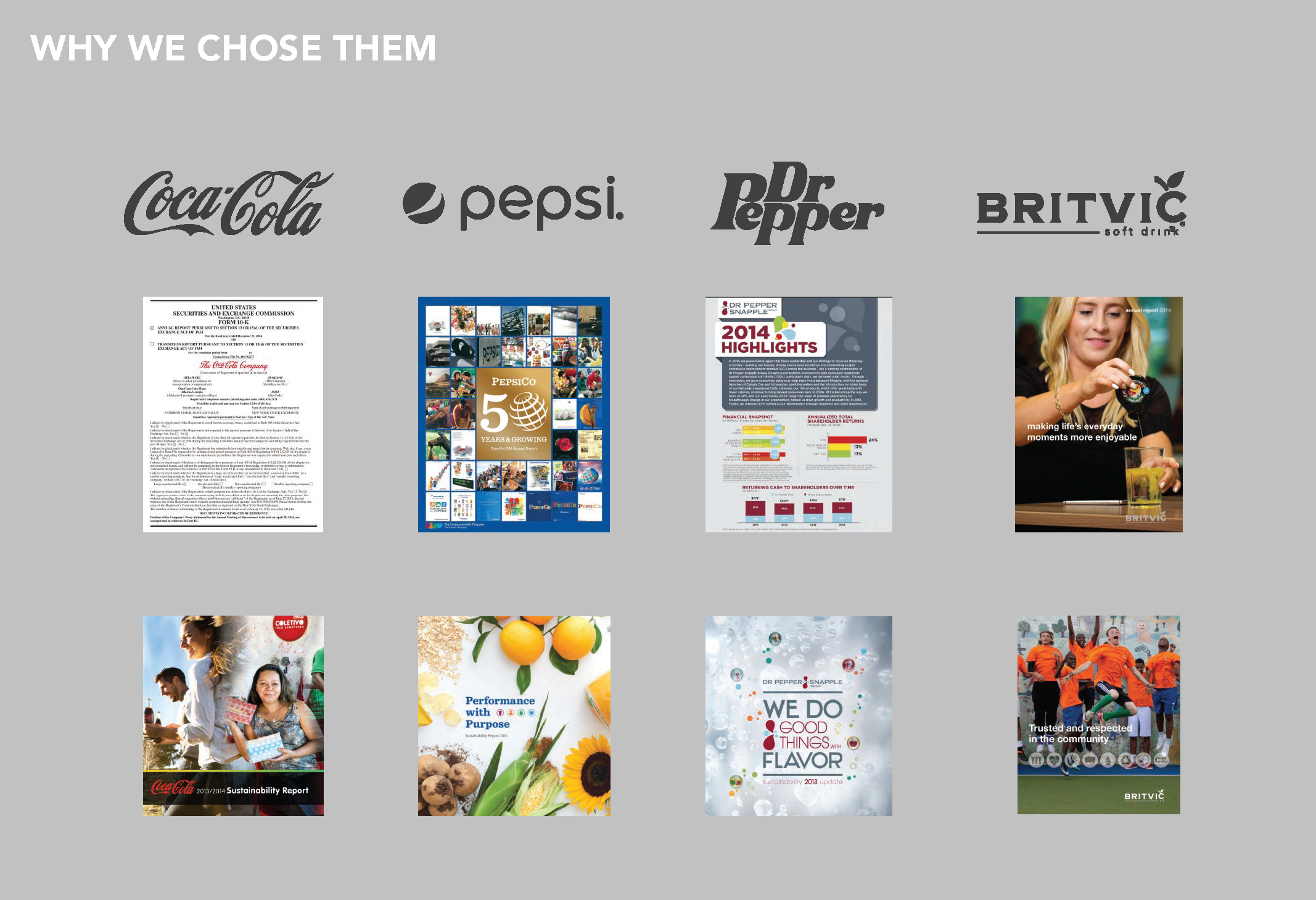
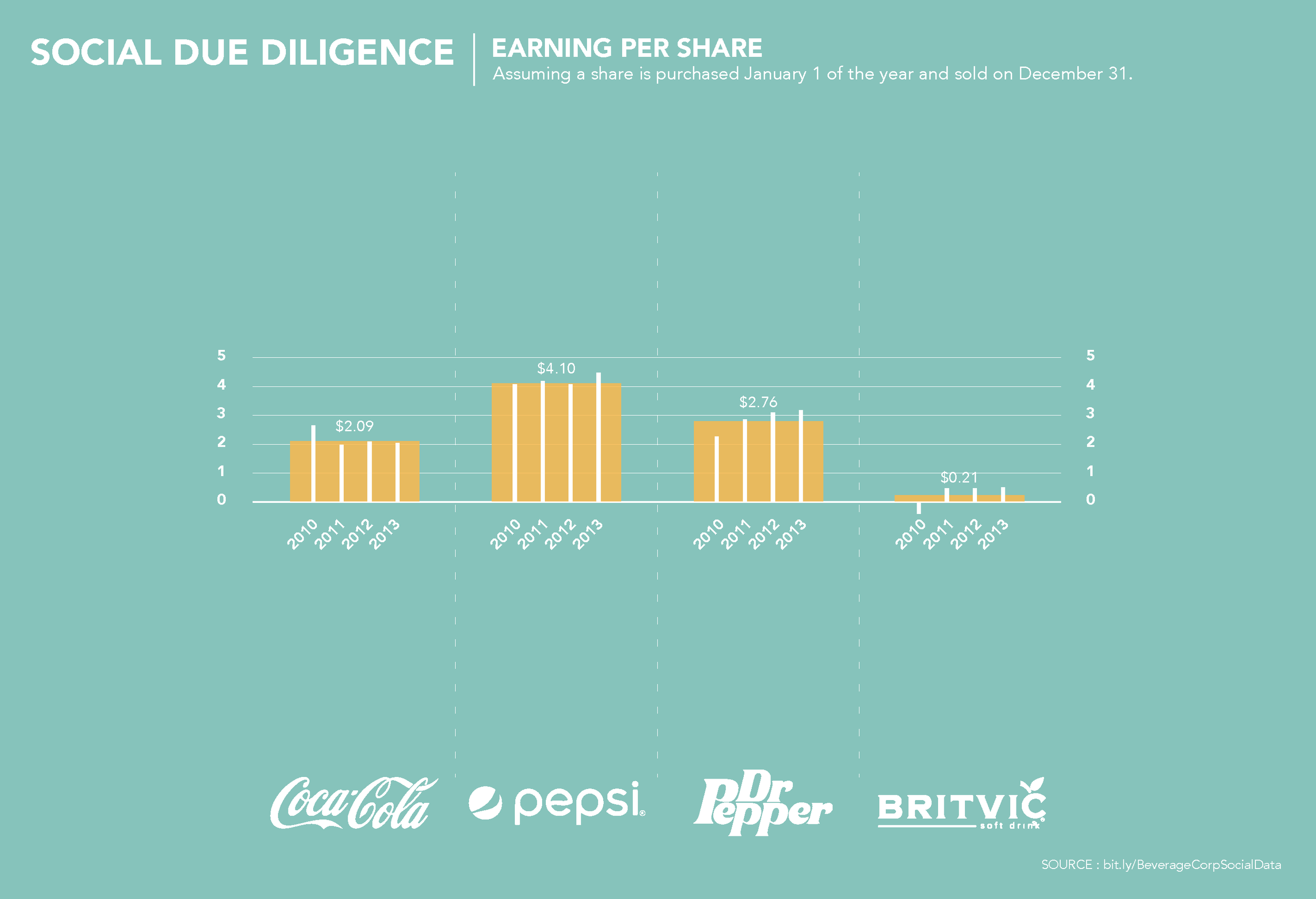
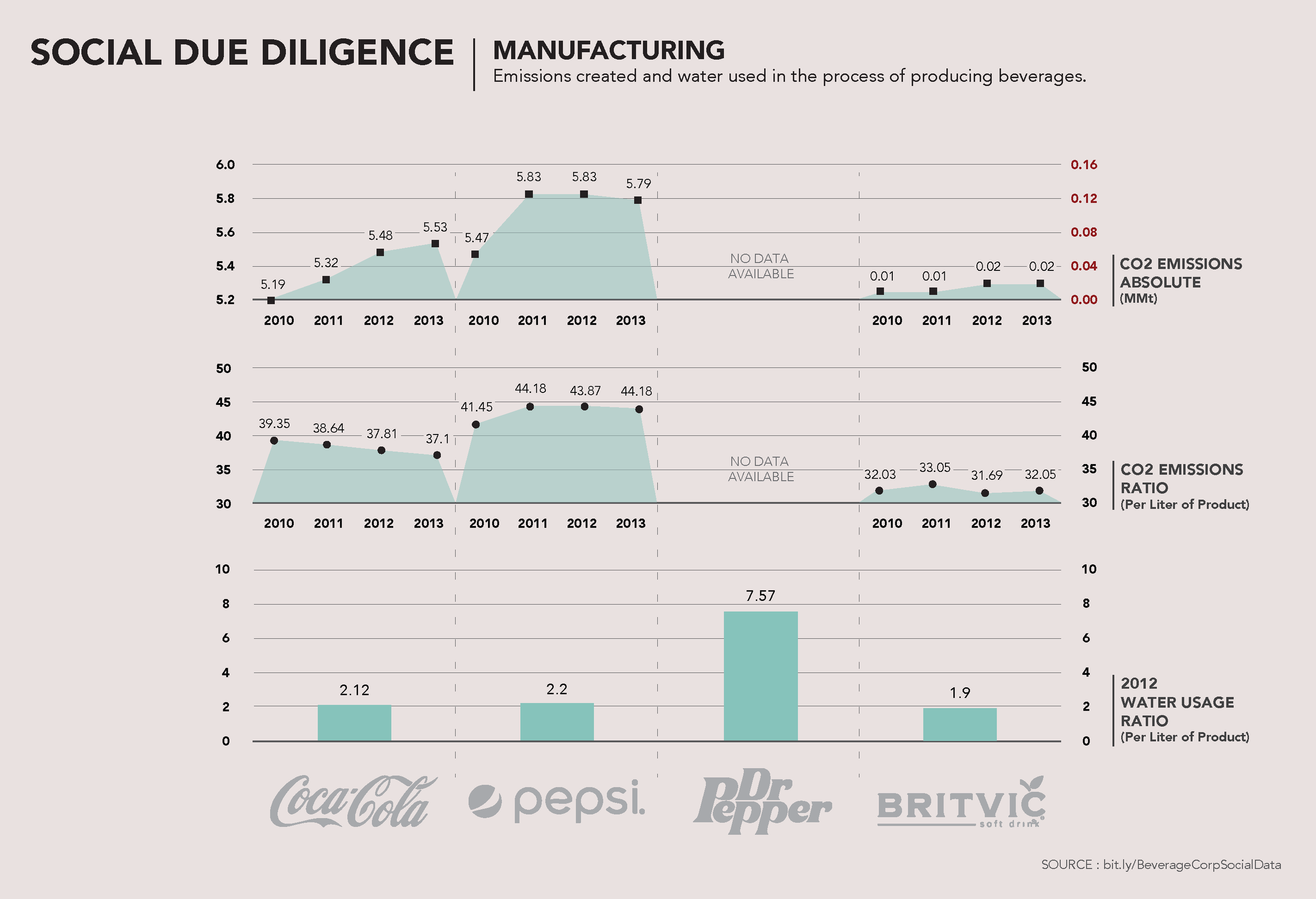

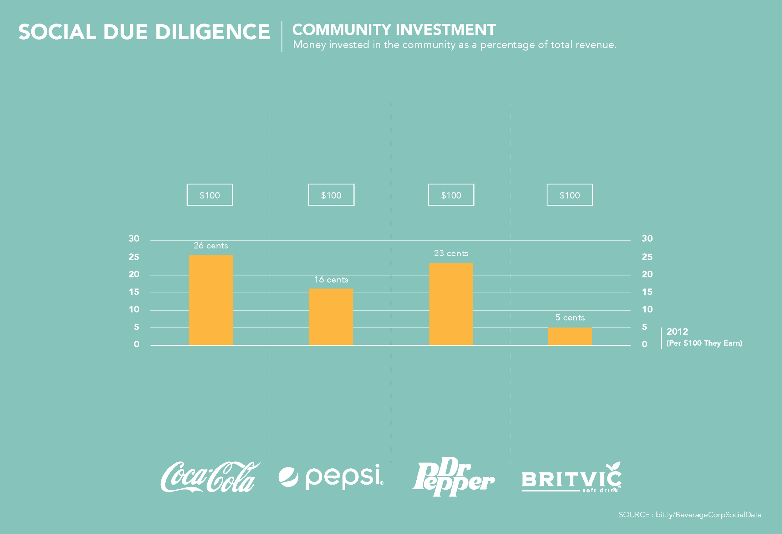

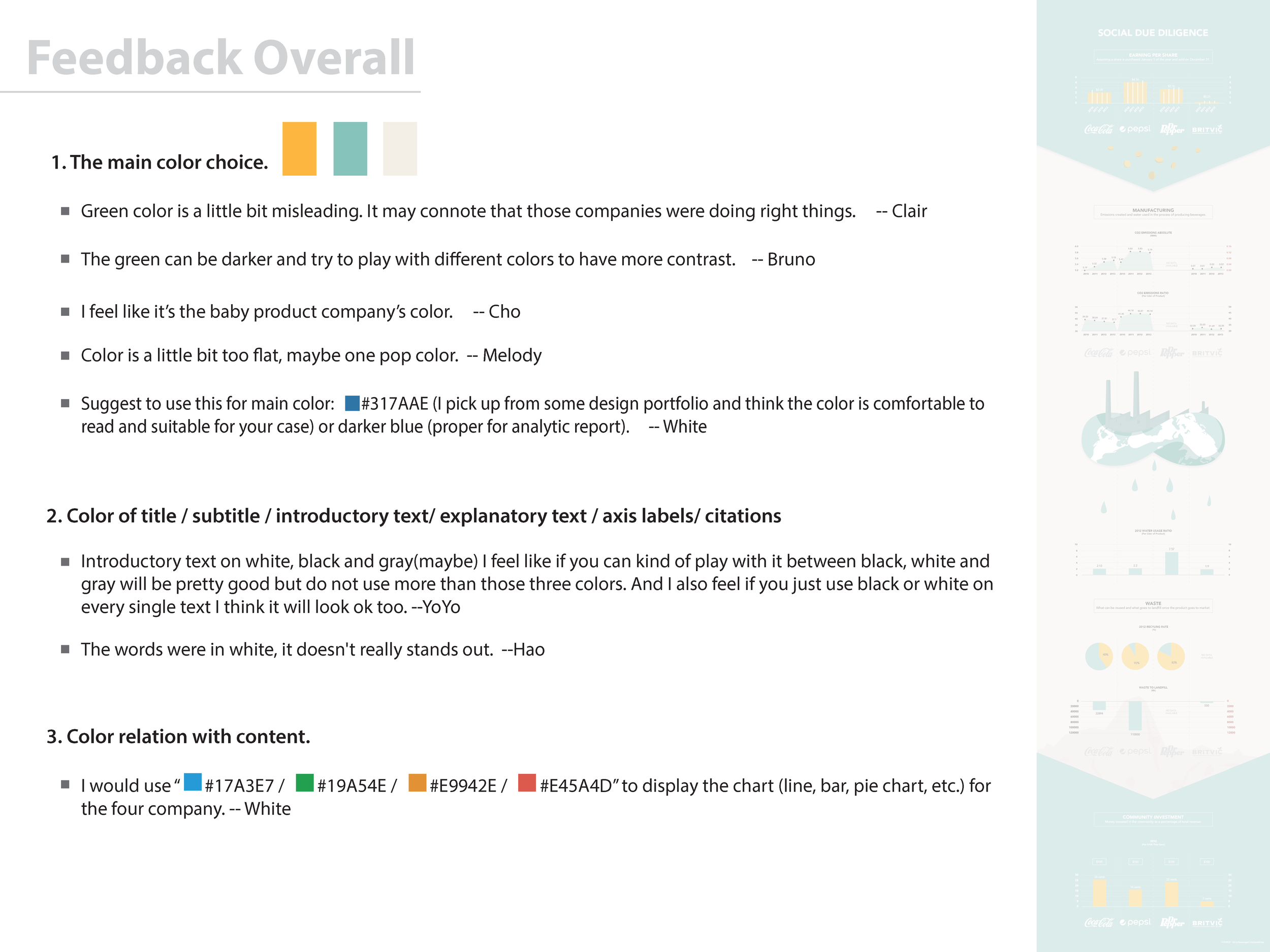
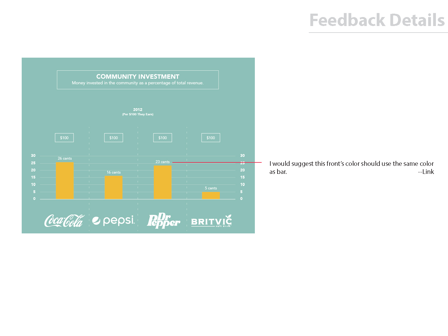
We chose four beverage companies who released financial reports and annual CSR (Corporate Social Responsibility) reports sharing their progress. Then, set up our purpose for this data visualization and categorized and cleaned data for later visual design usage.
This series of visualizations is meant to be presented as a scroll down series. Taken altogether, you begin to see that the money you make investing might not be the only thing you want to take into account when thinking about the overall impact of each company over time.
The visual takes the viewer from investment, through the manufacturing process, beginning to see images of the earth and the people on it.

Investment is about more than money
Our point, captured in the title, is to show that the social and environmental impact of companies is important to think about when deciding where to invest, or how to analyze a company.
When we shifted away from B-Corps to public corporations, we still wanted to capture social impact.
This series allowed us to do that, although finding the data was definitely a challenge!
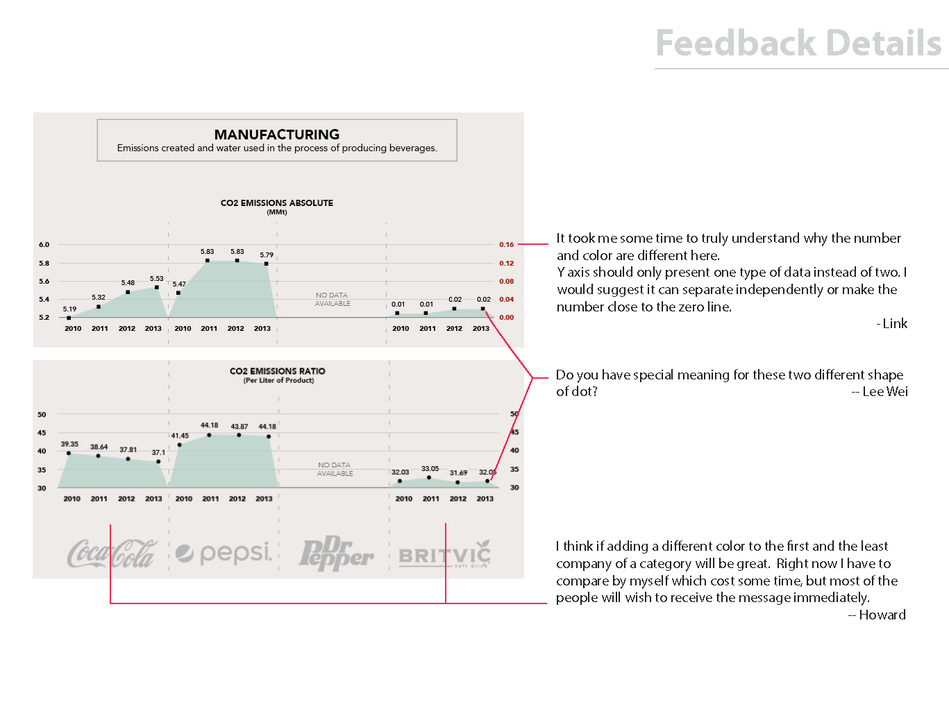
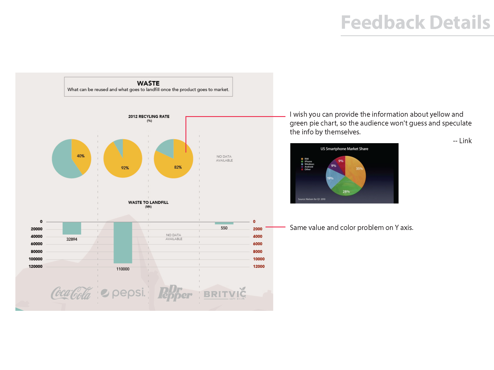
CSR reports are not standardized and companies can report on any indicators they pick
Another thing we learned is that many companies are happy to report on percentage improvement, but finding hard/actual numbers was much harder and some of the companies were much less transparent about those numbers, leading us to find them from other sources.