Transforming Clinical Trial Search for Patient Clarity and Confidence
Strategy
Product Design
Visual Design

overview
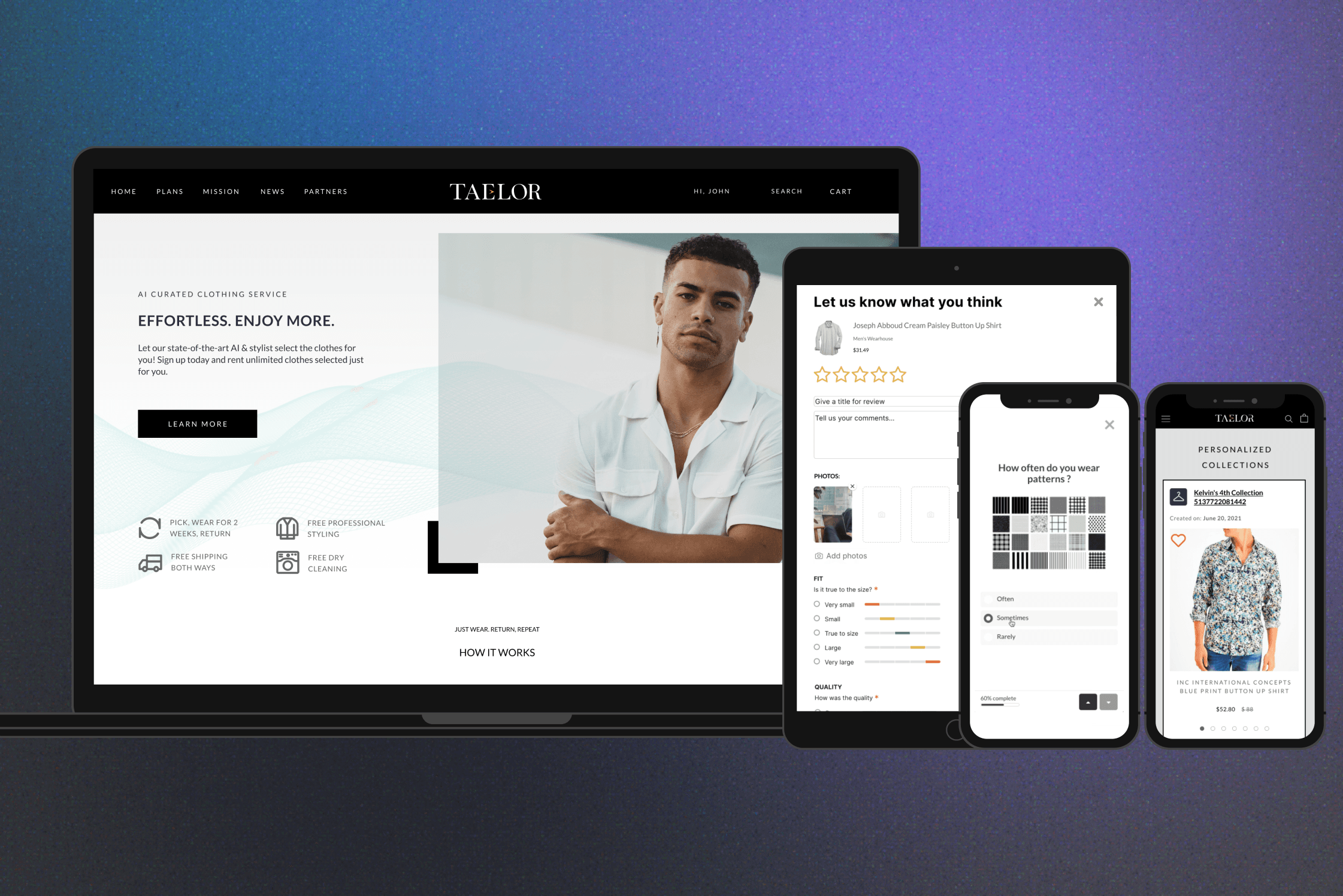
Patientrials is a network platform that connects patients with clinical trial providers through a trial search engine. This was a time-limited contract project to help the business redesign the current search experience into a patient-centered experience in order to increase CTR, improve bounce rate, quality of leads, and registrations.
Role
I led the redesign of the patient recruitment platform, a responsive web-based application, building a branded design system, marketing assets, and patient-centered experience that improved clarity, engagement, and enrollment.
outcome
The redesigned, patient-centered experience delivered measurable impact—reducing bounce rates by 36% and greatly enhance the usability of mobile experience and increase the user engagement with the site. The new design made the experience easier to navigate and helped patients feel more informed and confident in managing their expectations.
Timeline
3.5 month, 2020
Industry
Healthcare
B2C
Team
Business and product lead
Product Marketing Manager
Medical operation team
Engineer Lead
1.62 %
CTR for launch campaigns.
(2X higher than health industry avg. 0.83%)
-36 %
Bounce rate on search page
Easier
to navigate and clear from users' feedback.

aPPROACH
problems
I audited the original web application and research with the medical engagement team to synthesize the user experience gaps and pain points. Key UX principles that were prioritized in the redesigns
Objectives
Problem
Design
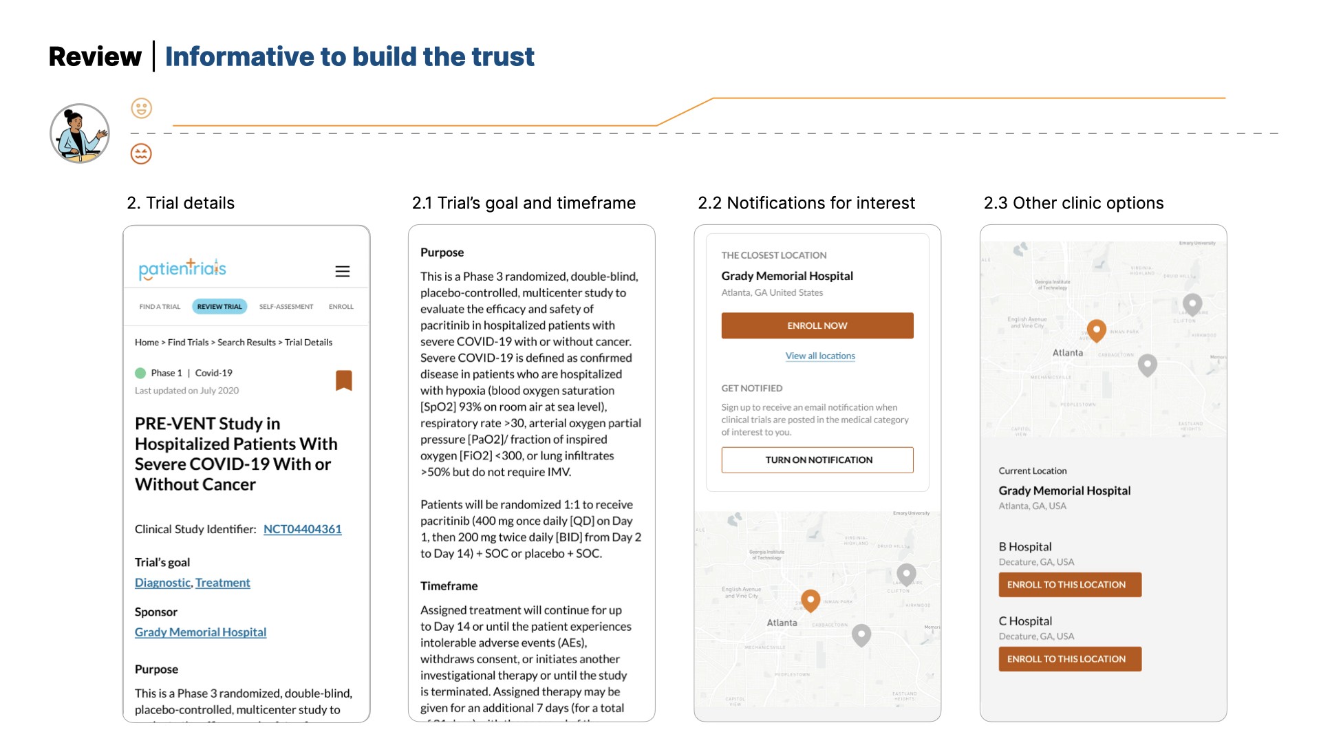
Information Clarity – Helping Users Make Informed Decisions
Hard to scan plain text, unclear flow with no step guidance that make the process confusing.
Hard to scan plain text, unclear flow with unclear guidance that make the process confusing.
→
Highlight information that matters to user at different steps and provide progress indicator to guide users.
Build confidence through consistency
Various elements in UI and interaction inconsistencies and the interface did not meet accessibility standards.
→
Apply a unified design system and streamline layouts to ensure consistency, improve usability, and meet accessibility requirements.
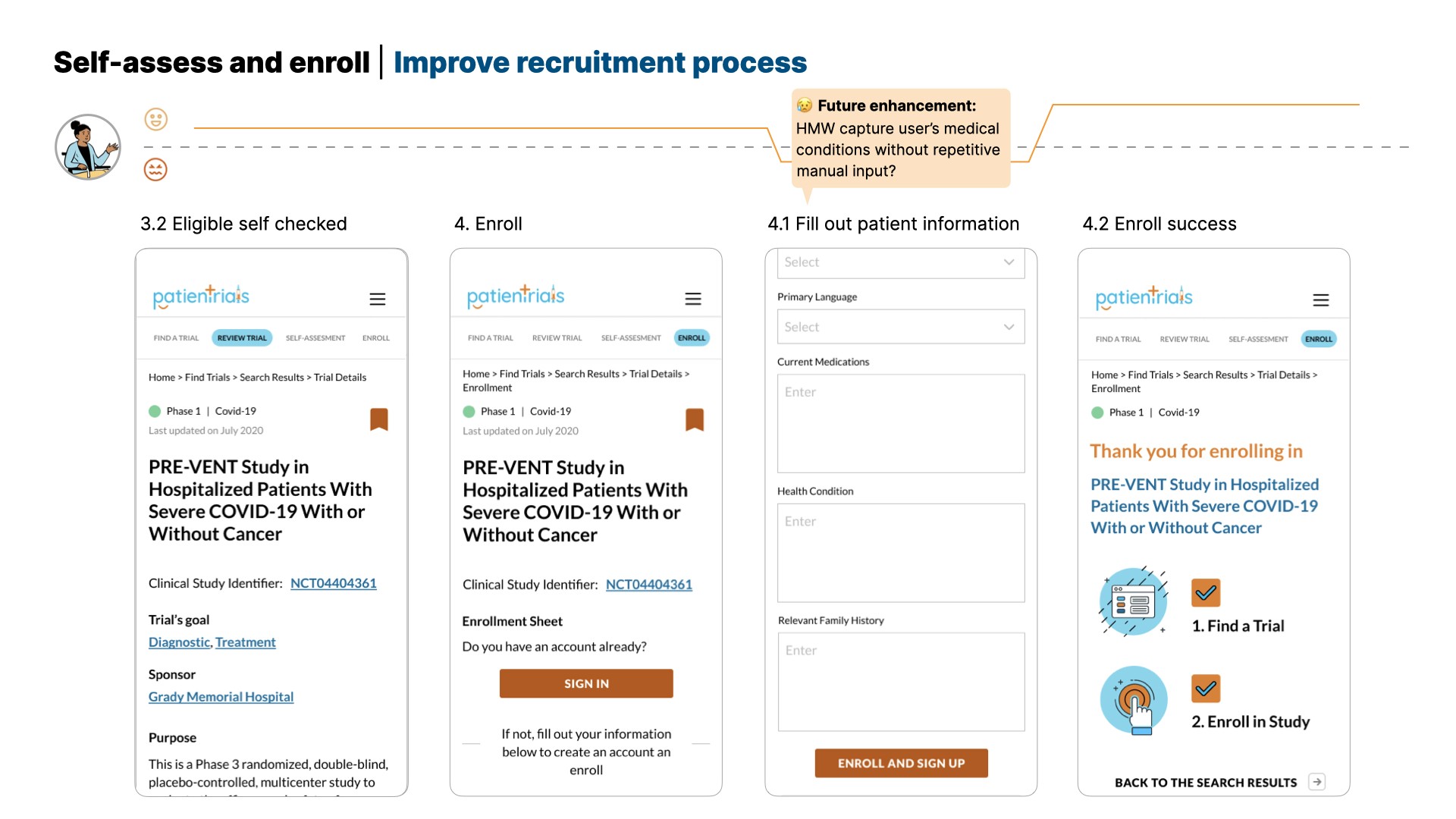
Process Efficiency – Streamlining recruitment and Eligibility
Users often waiting weeks to speak to medical consult to learn that they didn’t qualify after sign up to the study.
→
Enhance a guided eligibility self-check and clearer communication upfront to reduce wait time and build trust.

Original search engine index and result page

Original patient enrollment steps
Competitive analysis
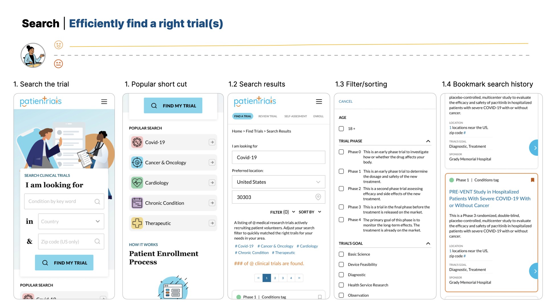
Also I conducted analysis to similar products to look into search filters, trial's information classification, progress indicators, and self-assessment tools to help patients navigate eligibility and improve enrollment success. Those information help me draw a recommended wireframe to discuss with team.

Some examples from analysis
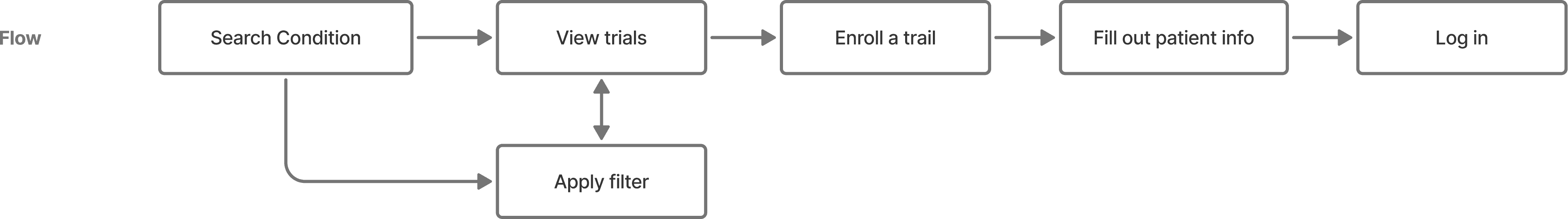
User journey
Collaborated with medical consultants to define patient personas and crafted user flows that optimized information hierarchy — reducing cognitive load by revealing details progressively as patients advanced through the search and evaluation journey.
Old user flow
Updated user flow

Prototype and validation- Index page
To achieve business goals short and long term, we need to build a evergreen, informative, or SEO-driven index page. I collaborated with the product marketing and business leads to strategize content that highlights key information, providing clarity without overwhelming the users. The page enhancement included:
Finding a trial is the primary offering. Clear to view on the page and functionally support user to start from condition and location search filtering.
Include “How It Works” and supportive information that help user set initial expectation.
Remove or delay to show the links to external that encourage users to explore the app first.

Original search index page
New search index page
To align short- and long-term business goals, we aimed to build an evergreen, SEO-driven index page that informs and engages users. I collaborated with product marketing and business leads to define key content priorities—providing clarity without overwhelming users.
Prioritizing the core function of “Find a Trial” with clear visibility and condition/location search.
Adding a concise “How It Works” and supportive information that help user set initial expectation and build trust.
Remove or delay to show the information that links to external to encourage users to explore the platform first.
Solutions
New trail page and enrollment prototypes
Visual Exploration & Design System
In the early ideation phase, I created and tested two concept mockups with the team to establish the visual direction. We determined that a warm, approachable style with friendly illustrations best reflected the brand’s tone and purpose.
Building on the existing logo palette, I created the team’s first design system to unify colors, typography, and components that created through the redesign. Following the release, the company adopted this system across its website and other digital platforms, creating a cohesive and consistent brand experience.

Illustration - ✅ More approachable

High quality photos - Professional but edgy

A series of launch-campaign marketing assets I created that drove traffics to the new site

Result
1.62 %
CTR for launch campaigns.
(2X higher than health industry avg. 0.83%)
-36 %
bounce rate on search page, greatly Improved.
Easier
to navigate and clear from users' feedback.
The marketing campaigns happened between Dec 2020 to Jan 2021 to attract target audience to trails with newly launched platform.
This case study highlights some facets of the work. If you’d like to explore more of the story, let’s connect!
More Projects


Transforming Clinical Trial Search for Patient Clarity and Confidence
Strategy
Product Design
Visual Design
overview
Patientrials is a network platform that connects patients with clinical trial providers through a trial search engine. This was a time-limited contract project to help the business redesign the current search experience into a patient-centered experience in order to increase CTR, improve bounce rate, quality of leads, and registrations.
Role
I led the redesign of the patient recruitment platform, a responsive web-based application, building a branded design system, marketing assets, and patient-centered experience that improved clarity, engagement, and enrollment.
outcome
The redesigned, patient-centered experience delivered measurable impact—reducing bounce rates by 36% and greatly enhance the usability of mobile experience and increase the user engagement with the site. The new design made the experience easier to navigate and helped patients feel more informed and confident in managing their expectations.
Timeline
3.5 month, 2020
Industry
Healthcare
B2C
Team
Business and product lead
Product Marketing Manager
Medical operation team
Engineer Lead
1.62 %
CTR for launch campaigns.
(2X higher than health industry avg. 0.83%)
-36 %
Bounce rate on search page
Easier
to navigate and clear from users' feedback.
aPPROACH
problems
I audited the original web application and research with the medical engagement team to synthesize the user experience gaps and pain points. Key UX principles that were prioritized in the redesigns
Objectives
Problem
Design
Information Clarity – Helping Users Make Informed Decisions
Hard to scan plain text, unclear flow with no step guidance that make the process confusing.
Hard to scan plain text, unclear flow with unclear guidance that make the process confusing.
→
Highlight information that matters to user at different steps and provide progress indicator to guide users.
Build confidence through consistency
Various elements in UI and interaction inconsistencies and the interface did not meet accessibility standards.
→
Apply a unified design system and streamline layouts to ensure consistency, improve usability, and meet accessibility requirements.
Process Efficiency – Streamlining recruitment and Eligibility
Users often waiting weeks to speak to medical consult to learn that they didn’t qualify after sign up to the study.
→
Enhance a guided eligibility self-check and clearer communication upfront to reduce wait time and build trust.
Original search engine index and result page
Original patient enrollment steps
Competitive analysis
Also I conducted analysis to similar products to look into search filters, trial's information classification, progress indicators, and self-assessment tools to help patients navigate eligibility and improve enrollment success. Those information help me draw a recommended wireframe to discuss with team.
Some examples from analysis
User journey
Collaborated with medical consultants to define patient personas and crafted user flows that optimized information hierarchy — reducing cognitive load by revealing details progressively as patients advanced through the search and evaluation journey.
Old user flow
Updated user flow
Prototype and validation- Index page
To achieve business goals short and long term, we need to build a evergreen, informative, or SEO-driven index page. I collaborated with the product marketing and business leads to strategize content that highlights key information, providing clarity without overwhelming the users. The page enhancement included:
Finding a trial is the primary offering. Clear to view on the page and functionally support user to start from condition and location search filtering.
Include “How It Works” and supportive information that help user set initial expectation.
Remove or delay to show the links to external that encourage users to explore the app first.
Original search index page
New search index page
To align short- and long-term business goals, we aimed to build an evergreen, SEO-driven index page that informs and engages users. I collaborated with product marketing and business leads to define key content priorities—providing clarity without overwhelming users.
Prioritizing the core function of “Find a Trial” with clear visibility and condition/location search.
Adding a concise “How It Works” and supportive information that help user set initial expectation and build trust.
Remove or delay to show the information that links to external to encourage users to explore the platform first.
Solutions
New trail page and enrollment prototypes
Visual Exploration & Design System
In the early ideation phase, I created and tested two concept mockups with the team to establish the visual direction. We determined that a warm, approachable style with friendly illustrations best reflected the brand’s tone and purpose.
Building on the existing logo palette, I created the team’s first design system to unify colors, typography, and components that created through the redesign. Following the release, the company adopted this system across its website and other digital platforms, creating a cohesive and consistent brand experience.
Illustration - ✅ More approachable
High quality photos - Professional but edgy
A series of launch-campaign marketing assets I created that drove traffics to the new site
Result
1.62 %
CTR for launch campaigns.
(2X higher than health industry avg. 0.83%)
-36 %
bounce rate on search page, greatly Improved.
Easier
to navigate and clear from users' feedback.
The marketing campaigns happened between Dec 2020 to Jan 2021 to attract target audience to trails with newly launched platform.
This case study highlights some facets of the work. If you’d like to explore more of the story, let’s connect!
More Projects
Transforming Clinical Trial Search for Patient Clarity and Confidence
Strategy
Product Design
Visual Design
overview
Patientrials is a network platform that connects patients with clinical trial providers through a trial search engine. This was a time-limited contract project to help the business redesign the current search experience into a patient-centered experience in order to increase CTR, improve bounce rate, quality of leads, and registrations.
Role
I led the redesign of the patient recruitment platform, a responsive web-based application, building a branded design system, marketing assets, and patient-centered experience that improved clarity, engagement, and enrollment.
outcome
The redesigned, patient-centered experience delivered measurable impact—reducing bounce rates by 36% and greatly enhance the usability of mobile experience and increase the user engagement with the site. The new design made the experience easier to navigate and helped patients feel more informed and confident in managing their expectations.
Timeline
3.5 month, 2020
Industry
Healthcare
B2C
Team
Business and product lead
Product Marketing Manager
Medical operation team
Engineer Lead
1.62 %
CTR for launch campaigns.
(2X higher than health industry avg. 0.83%)
-36 %
Bounce rate on search page
Easier
to navigate and clear from users' feedback.
aPPROACH
problems
I audited the original web application and research with the medical engagement team to synthesize the user experience gaps and pain points. Key UX principles that were prioritized in the redesigns
Objectives
Problem
Design
Information Clarity – Helping Users Make Informed Decisions
Hard to scan plain text, unclear flow with no step guidance that make the process confusing.
Hard to scan plain text, unclear flow with unclear guidance that make the process confusing.
→
Highlight information that matters to user at different steps and provide progress indicator to guide users.
Build confidence through consistency
Various elements in UI and interaction inconsistencies and the interface did not meet accessibility standards.
→
Apply a unified design system and streamline layouts to ensure consistency, improve usability, and meet accessibility requirements.
Process Efficiency – Streamlining recruitment and Eligibility
Users often waiting weeks to speak to medical consult to learn that they didn’t qualify after sign up to the study.
→
Enhance a guided eligibility self-check and clearer communication upfront to reduce wait time and build trust.
Original search engine index and result page
Original patient enrollment steps
Competitive analysis
Also I conducted analysis to similar products to look into search filters, trial's information classification, progress indicators, and self-assessment tools to help patients navigate eligibility and improve enrollment success. Those information help me draw a recommended wireframe to discuss with team.
Some examples from analysis
User journey
Collaborated with medical consultants to define patient personas and crafted user flows that optimized information hierarchy — reducing cognitive load by revealing details progressively as patients advanced through the search and evaluation journey.
Old user flow
Updated user flow
Prototype and validation- Index page
To achieve business goals short and long term, we need to build a evergreen, informative, or SEO-driven index page. I collaborated with the product marketing and business leads to strategize content that highlights key information, providing clarity without overwhelming the users. The page enhancement included:
Finding a trial is the primary offering. Clear to view on the page and functionally support user to start from condition and location search filtering.
Include “How It Works” and supportive information that help user set initial expectation.
Remove or delay to show the links to external that encourage users to explore the app first.
Original search index page
New search index page
To align short- and long-term business goals, we aimed to build an evergreen, SEO-driven index page that informs and engages users. I collaborated with product marketing and business leads to define key content priorities—providing clarity without overwhelming users.
Prioritizing the core function of “Find a Trial” with clear visibility and condition/location search.
Adding a concise “How It Works” and supportive information that help user set initial expectation and build trust.
Remove or delay to show the information that links to external to encourage users to explore the platform first.
Solutions
New trail page and enrollment prototypes
Visual Exploration & Design System
In the early ideation phase, I created and tested two concept mockups with the team to establish the visual direction. We determined that a warm, approachable style with friendly illustrations best reflected the brand’s tone and purpose.
Building on the existing logo palette, I created the team’s first design system to unify colors, typography, and components that created through the redesign. Following the release, the company adopted this system across its website and other digital platforms, creating a cohesive and consistent brand experience.
Illustration - ✅ More approachable
High quality photos - Professional but edgy
A series of launch-campaign marketing assets I created that drove traffics to the new site
Result
1.62 %
CTR for launch campaigns.
(2X higher than health industry avg. 0.83%)
-36 %
bounce rate on search page, greatly Improved.
Easier
to navigate and clear from users' feedback.
The marketing campaigns happened between Dec 2020 to Jan 2021 to attract target audience to trails with newly launched platform.
This case study highlights some facets of the work. If you’d like to explore more of the story, let’s connect!